 Zachari Saltmer
The job
One page. One action: a booked fifteen-minute call. The audience is a small business owner with six tabs open, deciding in the time it takes to read a sentence.
The client was me. I wrote the brief, set the budget, and rejected my own favourite ideas, which makes this the most honest project I can show: there is no client between you and the decisions, only the reasons.
A case study that only shows the finished page is a highlight reel. So this one publishes the reasoning in the order it happened: the constraints first, then the rules, the things the rules killed, and the first week’s real numbers.
The constraints, published
I published the constraints before writing a line, because constraints are what make a design checkable:
- One job per page.
- One idea per screen.
- Four questions, in order.
- Sources on the page, linked.
- One moving element at a time.
- System fonts, static build, nothing that loads before the words do.
Every one of these is a decision someone can hold me to. Most briefs hide the boundaries so the work can wander; this one drew them first, then stayed inside them.
The skeleton is working memory
Working memory holds about four chunks of information (Cowan, 2001). So the page asks exactly four questions, in order: Can they take it in? Do they feel it? Do they believe you? Will they act now?
Each question gets one screen, one idea, and one piece of evidence. The structure is a cognitive budget, not a layout mood. Anything that didn’t serve one of the four questions was cut, including things I liked.
Fifty milliseconds to earn the rest
The first impression gets fifty milliseconds, faster than a single eye fixation (Lindgaard et al., 2006). So the hook is the entire first viewport: “Your next customer decides in 50 milliseconds.” No logo parade above it. Nothing loads before the words do.
The logo tried anyway. In the first draft it sat above the hook, small and proud, and it competed with the sentence for the same fifty milliseconds. It came out twice before the page shipped, because the mark can live in the corner of your screen forever and the hook gets one glance.
The hook works because it is about the reader’s decision, not about me. A stranger reads one sentence and the page has already demonstrated what it sells: it just made a decision easy.
The only graphic on that first screen is a dotted rendering of a brain, quiet enough to sit behind the words. The animation budget was spent there, on one moving element that demonstrates the medium instead of decorating it.
Hick’s Law killed the dropdown
Every option a page offers costs measurable decision time (Hick, 1952). The first draft offered a services dropdown: eight paths, each one a small tax on a reader who came for one thing. It died in the second draft, and the page got faster the moment it did.
What replaced it is a goal picker with three options, because three is what the research supports and what the audience needs. Service pages carry the detail; the landing carries the choice. A dropdown answers everything and decides nothing.
Banner blindness killed the clever CTA
Readers stop seeing things that look like decoration (Benway & Lane, 1998). The tempting move is a clever call to action: a different phrasing on every screen, something to keep it fresh. Fresh is exactly the problem. To a scanning brain, variation reads as decoration, and decoration gets filtered before it is understood.
So the call to action appears three times with the same words and the same position. Each repetition is a fresh chance to catch the reader at the exact moment they finish deciding, and the sameness reads as stability.
The thumb zone decided the button
On a phone held one-handed, most of the screen is aspiration and the bottom third is reach (Hoober, 2013). The call to action lives there, inside the arc, where a thumb lands without gymnastics.
On desktop the button holds the same position in the layout. One page, one gesture, learned once, whatever the screen. The reader should never have to re-learn where the decision lives.
Trust, the hardest rule to fake
Trust wasn’t a badge or a client logo row. It was a name, a portrait, clickable sources at the foot of the page, and links out to essays where the reasoning runs longer. Everything checkable, nothing asserted.
People don’t trust claims. They trust claims they could disprove and didn’t need to. That is why the sources sit on the page instead of in a footnote to nobody.
The first week, measured
| Visits | People | Bounces | Clicked through |
|---|---|---|---|
| 47first week to date | 18unique visitors | 0they stayed and read | 36.4% reached for the calendar |
Analytics is first-party and self-hosted: no cookies, and every pageview carries a tag for the month’s design variation, so future redesigns get compared against this baseline instead of a feeling.
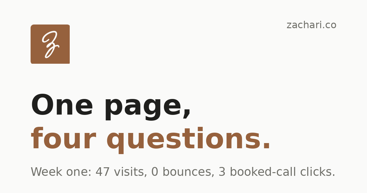
First week to date: 47 visits from 18 people. Zero bounces. Average visit around ten minutes. Three visitors clicked through to book a call or write (6.4 percent).
Small numbers, honestly early. The point was never the size. The point is that a stranger can land cold, read for ten minutes, and reach for a calendar, and that from here every change gets judged against this week rather than against whether the designer slept well.
What gets tested next
The page is a living one: each month it ships a different design system over the same four-question skeleton, and the tags keep the comparison honest. The first variation goes up for judgement in December. Keep, iterate, or kill, decided before the next one ships.
The four questions, asked of me
A framework you don’t apply to yourself is decoration. So this case study gets audited by its own skeleton.
Can you take it in? One idea per section, the four questions on one figure. Do you feel it? The first week’s numbers sit on the page instead of in a claim. Will you believe me? The constraints were published, the sources are linked, and the live site is one click away to check. Will you act now? The link below is the only ask, in the same place every time.
If the answer to any of the four was no, this page would still be a draft. It isn’t, which means the audit passed out loud, where you could watch it.
Want the same treatment for your site? That’s the web design service.